10 UI Sections I Reuse in Every SaaS Product
Reusing sections as my templates
As a product designer and founder, I've spent the past years building several online products from the ground up.
And while working on different SaaS tools, I started noticing something interesting.
I wasn't designing everything from scratch anymore.
Instead, I kept returning to the same UI sections again and again.
Once I created layouts that were stable, responsive, and visually balanced, it didn't make sense to reinvent them for every new project. I would simply reuse the structure and adjust a few details:
- colors
- typography
- branding
- messaging
Over time I realized something simple: most SaaS products share the same structural foundation.
When these sections work well together, it becomes much easier to build a cohesive interface.
These are the 10 UI sections I reuse in almost every SaaS product — and the ones included in my kit.
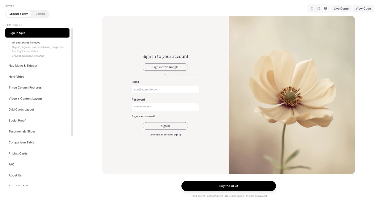
1. Sign In & Sign Up Pages
Login and sign up pages should be simple and familiar.
Users should instantly understand how to access their account or create one, without confusion. Minimal design, clear structure, and a focused form (with minimal fields on sign up) keep the conversion funnel smooth. The kit includes a sign-in layout you can adapt for both flows.
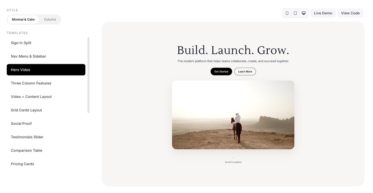
2. Hero Section
The hero section is where users decide within seconds if they want to continue exploring your product.
A strong hero usually includes:
- a clear headline
- a short explanation
- a strong call-to-action
- sometimes a product preview or video
Clarity matters much more than clever wording. In my kit you'll find hero variants from minimal to video-led, so you can pick the tone that fits your product.
3. Features & Content Sections
After the hero, the product needs to explain itself.
Content sections guide users through the story of the product and highlight key features or benefits — comparison tables, feature grids, three-column layouts, about us, and social proof. These sections answer:
- What problem does the product solve?
- How does it work?
- Why should users trust it?
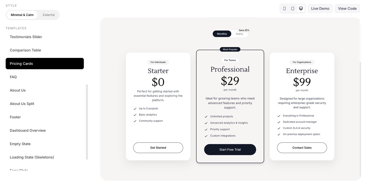
4. Pricing Section
Pricing pages have a direct impact on conversions.
A well-structured pricing section usually includes clear plan comparison, a highlighted recommended plan, simple feature lists, and strong CTA buttons. Simplicity and transparency help build trust.
5. Dashboard
Once users sign up, the dashboard becomes the main environment of the product.
Good dashboards focus on clear navigation, visual hierarchy, easy access to actions, and reducing cognitive load. My kit includes dashboard overview layouts, stats cards, and related patterns so the app side stays cohesive with the marketing side.
6. Navigation
Navigation ties the whole product together — whether it's a minimal top nav, a sidebar, or a more prominent menu.
Consistent navigation across landing and app makes the product feel like one system. The kit includes navigation components that work across marketing and dashboard contexts.
7. CTA Sections
Calls to action appear throughout the page: above the fold, after features, and near pricing.
Strong CTA sections keep the next step obvious without feeling pushy. I reuse a few CTA patterns — elevated, gradient, or with supporting imagery — so each page can lead clearly to sign up or contact.
8. FAQ Section
An FAQ section answers common objections and reduces support load.
A simple accordion or Q&A block near pricing or the footer helps users self-serve and builds trust. One clear FAQ section is enough for most SaaS landing pages.
9. Footer
The footer acts as the anchor of the website.
It usually contains navigation links, legal pages, contact information, and sometimes social links. Even though it sits at the bottom, it plays an important role in structure and trust. The kit includes a comprehensive footer you can trim or expand.
10. Empty States, Error & Loading States
When there is no content yet — or something goes wrong — the UI still needs to guide the user.
Empty states, error states, and loading states explain what's happening and what to do next. They reduce confusion and make the product feel polished even before data exists. The kit includes these so your app feels complete from day one.
While designing different products, I realized that I kept returning to the same sections again and again.
Once these sections are well designed and responsive, they can easily be reused across different products with only small adjustments to branding or messaging.
This approach makes the design process faster and helps maintain a cohesive interface across the whole product.
One lesson I learned along the way is simple:
Less is almost always more.
Clear messaging, strong CTAs, and balanced layouts often perform better than complex designs.
A good template leaves space for your own style while still providing a solid foundation for the product.
If you want to ship a bit faster, the kit's there when you need it.
Keep reading
More from the magazine
I Built UI Kits From Real SaaS Work — You Can Drop Them In for a Polished UI
These UI kit sections come from real SaaS products I've built. They're designed to drop into any project — AI-generated or not — and make it look like a finished product.
Best SaaS UI Design Templates for Developers Building SaaS (2026 Guide)
Building a SaaS product? Explore the best SaaS UI design templates and UI kits to launch faster with React, Tailwind, and modern product design.
These UI decisions doubled revenue in a real SaaS product. Now you can preview, buy and use them too.